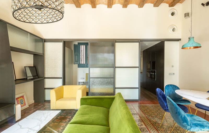
The Duke occupies a prime location in Barcelona combining the advantages of living in the historic centre of Barcelona with direct views of the sea and being close to a nearby square currently being redeveloped. Taking these aspects into account, the aim for this project soon became clear: to open the apartment up to the street and position the most functional areas to the darker side of the apartment. Following this premise, a new layout was proposed that would be more functional, have a greater variety of materials and maximise the light.
The position of the kitchen was key to unlocking the other spaces, occupying the corridor area and freeing up more interesting spaces for the living room and bedrooms. Its linear layout underlines its decorative function in an important area of the apartment. As a result, the bathroom adapts to the available space to create a light filled corridor, and at the same time increasing the size of the workspace. The master bedroom is given a privileged location with direct light and views through the living room.
A combination of new materials was proposed to compliment the original feel of the existing elements. We recovered the tiled flooring in the living room, which had been buried under a poor quality stoneware floor for years. Using darker shades than usual for flooring of this type, the perimeter of the uncovered area is complemented with maroon coloured tiles, in line with the existing colours of the tiled floor. Whereas, in the bathroom, we opted for more vivid colours. Throughout the rest of the house, a natural wood parquet was chosen so as not to compete with the striking colours of the tiles. In terms of cladding materials, we chose high quality materials in the kitchen and small format tiles in the bathroom, consistent with the colour scheme of the floor.
Taking into consideration the pre-existing mix of materials, we looked for a common denominator that runs through the various parts of the apartment. We chose steel for its versatility, its durability and the contemporary appearance.
Using this material we designed shelving and multimedia furniture in the living room and, in a similar style, we defined a set of sliding doors that would incorporate different options of privacy and transparency. We used the same sliding door system in the bathroom and the second bedroom, as well as in the shower cubicle. The different finishes and degrees of transparency of the glass allowed for greater versatility and privacy preferences. We took advantage of the existing height of the bedrooms by creating a mezzanine storage space with a steel structure and handrail.
The different steel elements form part of a common thread that runs through the apartment. They define the boundaries between zones, accentuate the height of the building and mark the contrast between the original features and those introduced by the renovation.
Designing The Duke presented a challenging structural project that set out to modernise an old apartment using contemporary architectural resources, while aiming to retain its classical, elegant spirit.


Thanks Sue, this was useful.andy kaufman tony